Saturday, 19 November 2011

Fruit Bowl, Early Revision, Week 1-3


Modelled by Dan Wade.
November 29:
I am starting to revise my light setup. There are two new rim lights, one along the side of the far right banana and another focused on the orange to exaggerate the white specular highlight. I have added bump maps to both bananas to create depth in the bruises. I am currently working on textures for the grapes and cherries, to see if more detail can be seen at this distance from the camera. By the end of the week I plan to test render the shaders and finalize my light set-up. The bottles and self-made glass shader will have to wait.

Nov.19:
With a closer cropped camera and re-positioned bottles this week, I'm struggling to revise the banana texture. I have done a few passes with an older spotted banana, but found it difficult to place the dots in a natural looking way. Now I plan to work in layers to paint the stem and add some age this way.The glass is a downloaded shader, I will return to it later with my own shading network, (to the emphasize colour and surface thicknesses of each bottle individually). I've added more light to see the textures that I'm working on and adjusted the maps of most of the fruit. The plums, apple and pear have reflection maps and bump mapping. Only, the pear looks flat right now and the orange is plastic-looking. As well, I'm trying to match the lighting conditions in this reference picture. See the specular highlight on the pink lady apple.

Nov.14:
I've started to revise the light set-up; this version has a spotlight as the key light. It looks too even and dull at this stage, it will be a bright mid-day scene when I am finished. Also testing out the resolution of the apple and pear textures, and re-cutting the blanket UV. 


Wednesday, 19 May 2010

Student Work: Week 1-3, "Night Scene"


Modelled by Christophe Desse and Matthew Thain.

Week 2, May 10-14, 2010: 
This week I have created a soft light box beside the truck so that colour and specular highlight will be visible in the night scene. It works like a real life reflector or white card to bounce light onto an object. I have also shifted the composition because earlier the face on the billboard was awkwardly cropped off. The neon lights require more focus here. I have been playing with placing lights and the colour fog of neon. (Top image only)

Week 3, May 15-19: 
This week I have spent a lot of time tweaking lights and deleting unnecessary lights. I have found more reference images on-line to see the way that colour falls off of neon lights. I am trying to match my florescent lighting on the view of florescent lights seen above the Lake theatre in this first photo.

Render layers have also been planned. A proper Beauty Pass is almost complete. At this point I can see how much further I need to go to use render layers properly. Ideally, I should be able to assemble the different aspects of my image, and use effects in After Effects to amp up or turn down the intensity of each layer. I am learning this more intimately now that I am working with a still image that does not have animation. Render time is faster. The final image at the bottom is a test Beauty Pass. 

Friday, 7 May 2010

Student Work: Week 10-18, "Neon and Chrome"


Modelled by Christophe Desse and Matthew Thain.
March 21, 2010: 
I have added florescent lights to the exterior of the garage. See the upper recesses of the garage. There needs to be lighting in there for this scene to be lit realistically. Over all, the lighting looks too even in quality and the colour temperature of sun light versus the florescent lights does not make sense. Florescent lights should not be as bright as the sun, or orange in colour, matching the sunset tone on the facade of the building. I am hoping to correct this in After Effects, as there are three types of lights in my scene, and I can use blending modes to adjust light intensity.

Lighting is broken down into three parts, first there is the key light. This is the sun. Then there is interior lights in the garage, which are both fill and bounce. Mostly these are fill lights and they radiate from the florescent tubes and the ceiling lights in the far back of the garage. Then there are the florescent lights seen at the end of the animation, in the upper levels of the parking garage. These lights are bounce lights, and they are aimed upwards to create a tunnel effect. Now there is an illusion of depth.


April 7, 2010: 
Here is a more realistic looking revision of the windshield ramp, in comparison to the yellow windshield from previous weeks. I have been working on a rust detail, see the second shot. There is a hint of orange on the top of the bumper. I hope to control this effect later, and tone it down to a more natural red-brown colour using a render layer. Also, this shot is from my key light render layer, and I am planning on amping up this contrast of light and dark in my final rendering.

April 8th to April 12, 2010: 
There are three types of lights in my scene, and I can use blend modes to adjust the intensity of these three different parts of the scene. There is the key light, the sun (Third image from the bottom). Then there is interior lighting in the garage, which is characterized by both fill and bounce; mostly fill, radiated from the florescent tubes and the ceiling lights. (Here is the second shot from the bottom). Then there are the florescent lights seen at the end of the animation, in the upper levels of the garage. (See the last image.) Theses are bounce lights, aimed upwards to create a tunnel effect, a sense of depth. I have been trying to finesse the interior lights, to create a hazy cast of light.

April 20, 2010:
(The fifth and sixth images show the reflection and neon lights passes respectively). Most of this time I have spent setting up and testing out render layers in After Effects. I have had to make adjustment layers to fix textures and lighting after my preliminary test renders. I tried re-rendering the scene with the truck removed from it, so that the diffuse layers of my three lighting effects would render faster separately. This was not such a successful undertaking. I found that there are now blotchy dark shadows, which are now noticeable. These have resulted from low final gather settings. So I retested the scene and m now rendering once again.

Student Work, Week 4-9, "Neon and Chrome"


Modelled by Christophe Desse and Matthew Thain.

February 27, 2010: 
I have refined the time of day, it is bright with daylight. I want to showcase the red metal surface of the billboard, which draws out the Frankenstein and Mummy images. This change to the billboard material is also present in the third shot. I am also experimenting with a glass shader that I created in the Hypershader, using a sampler utility node and a ramp shader. My goal is to construct a grimy glass texture, implying that this old movie house has been around a while. There is a story developing surrounding the setting of this scene.

March 7, 2010: 
Here I am refining the grungemaps,in the interior of the garage, which will be seen in the animatic later. The pavement texture has been revised, as well as the bump quality of all of the shaders in the scene have been adjusted. I played more with the glass windshield, to add more reflectivity, and am trying out a dirt texture on the billboard. Mostly I am concerned with the truck's surface, which is damaged looking. It needs a mesh smooth, I think.


Mid-March, 2010:
This week, I have blocked in the animated path of the truck, and worked on the camera path. The interior is much more lit up now, due to the area lights setup above the florescent tubes. The far wall is not hidden in full shadows, and the windshield, car paint, and chrome surfaces of the truck are highlighted. I am adjusting the placement of the pavement in the UV Texture Editor. You can see a stain in front of the truck now. (Final two images.)


Late March, 2010: 
I've also added a new texture to the sewer manhole, as the camera path establishes a close-up now. Nearing the end of this project, I have changed the size of the viewport and need to fill in these outer area textures, along with doing a final pass on the Grungemaps, Specularity of Metals, and Shine of glass objects.

Thursday, 6 May 2010

Texture Photos


I try to carry my camera with me in case anything interesting stands out. I used this headlight photo as a texture in the "Neon and Chrome" scene. Some of the other shots I intend to use later in the "Carnival" scene.

Monday, 26 April 2010

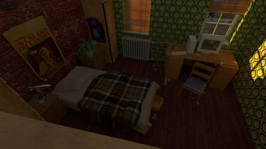
Student Work, Log of Work in Progress, "Bedroom"


Modeled by David Vacek, design by David Tousek.

February 17 to 19th, 2010: I have established some basic textures in order to flesh out the personality of the space. I am aiming for an overwhelmed feeling, as if the disappointed appearance of the room reflects the woman who lives in it. The old white radiator is based on the variety found in old Toronto homes. I am playing with textures to imply that the floor is scratched and damaged. I have darkened the chair to create a more realistic feeling, and altered the colours on the bedspread.

February 24 to 26th, 2010: At this stage, I am completing my 1st pass of diffuse textures, bump maps, and some grungemapping. There is a lot of specular shine on the floor, and that will be resolved later. I worked most of the week on cropping the wallpaper, and placing a basic grungemap and bump map onto it. There is a small flaw in the way that the wallpaper pattern repeats. This will be fixed later. A strong Mental Ray Dialectic shader has been placed on the ceiling light. The brightened scene draws the eye to the wood grain on the floor.

March 7, 2010: I am introducing a new camera angle to show more surfaces for the later animation of cats. The wallpaper texture has been redone in photoshop, so that the UVs do not crush together where the pattern ends and starts to repeat again. But it still needs work where I have extracted the wall as different meshes. See the right window, the pattern gets larger there. A photo I shot of a tree has been masked in photoshop and is now set outside of both windows. This detail brings more depth to the scene, and adds a sense of realism.

March 17 to 24th, 2010: Playing with the camera again to show a low-level cat's eye view of the floor. Specular Mapping has been done to the floor and brick wall. A lot of sparkles from final gather have been showing up and I am trying to control this with putting a texture in the reflectivity channel and by adjusting the glossiness of the surface. The brick wall grungmap has been moved around in the UV Texture Editor to show choice parts of the brick pattern grunge. The white smudges are suppose to look like poorly applied spackle that was applied to repair cracks.

April 3, 2010: Planning out lighting to emphasize scratches on the floor. I am hoping to express more of a dismal atmosphere with the upcoming details on the project. Further lighting trails will happen in order to set up a time lapse from morning to night. My cat model will have to wait until these more important aspects are completed.

Neon Cats Photo: This is the image inspiring me to create a cat lady setting, with an unsettling air in daylight. The photographer is Sandy Skoglund. Later, I intend to animate the scene a second time, as a nightmarish scene with glowing cat eyes. I want to rig and pose a cat I have modeled, but that is not my focus now. I need this scene to work on its own, with descriptive lighting and texturing to express a dismal setting.

http://collection.fraclorraine.org/collection/showtext/490?lang=en

Features a past "Renderman Art Challenge" personal project that I've tweaked to showcase my lighting-rendering skills. See the...